LED Colors and Vision (pics)

UnknownVT

Flashlight Enthusiast
Joined
Dec 27, 2002
Messages
3,671
After the long and illuminating thread -
Preserving Night Vision - Colors?


I was reminded about how our eyes see colors, and wondered about which colors gave us better definition for detail.

For example we know:

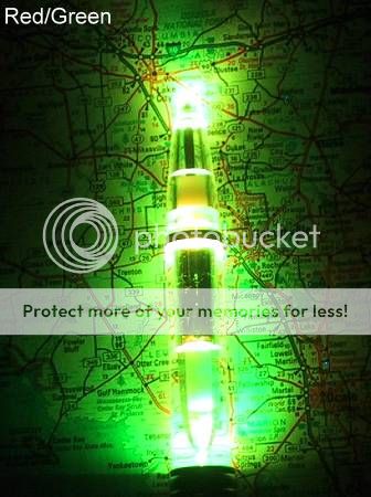
yellow is seen when red and green are combined
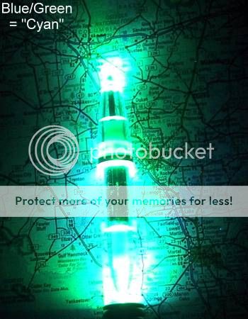
cyan is seen when blue and green are combined
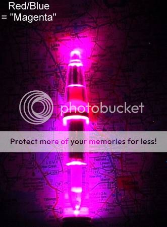
magenta is seen when red and blue are combined
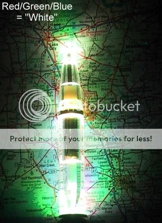
"white" is seen when red, green and blue are combined

I wanted to do somethng to see this for myself - which meant I should have red, green and blue LEDs/sources of light. But I didn't own these colors (other than red) since I have not had practical use for them.

Then I remembered that a good friend at a radio station gave me one of those illuminated pens that went through several colors..... yes, indeed it had red, green and blue LEDs. The LEDs were (obviously) not intensity/brightness balanced) the green looked brighter than the others with the blue the dimmest.

So here's the experiment -
I took photos (with fixed daylight white balance set) of the pen illuminated with:
red, green, blue LEDs on their own - then
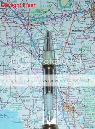
red/green; blue/green; red/blue and red/green/blue combinations, and an additional photo with daylight balanced flash for comparison -
but as an sort of "bonus" I photographed the pen on a Rand McNally map page here are the results:

Daylight balanced Flash ............ & ............ "White" = red/green/blue
Flash2S.jpg
WhiteS.jpg


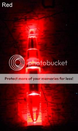
Red .................... & .......................... "Magenta" = red/blue
Red3S.jpg
MagentaS.jpg


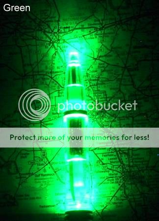
Green ........................... & .......................... "Yellow" = red/green
GreenS.jpg
redGreenS.jpg


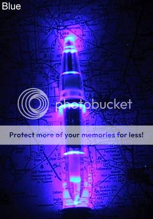
Blue ........................... & ........................... "Cyan" = blue/green
BlueS.jpg
CyanS.jpg


Comments/Observations

Red -
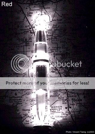
I noticed immediately that Red seem to have very poor sharpness/definition - it wasn't poor focus since the pen itself is very well focussed/sharp - neither was it camera or subject movement - again the sharp pen attests to that. I tried several shots to see if I could get a sharper image - they were all as bad - this one was the sharpest I got and I used a shade more sharpening in my photo editor - just so the image would not be as blurred. If one examines the image closely one can see near the tip of the pen very low contrast/pale image of routes and numbers are are actually very sharp.... (note: I had no problems with any of the other colors except perhaps "Magenta")

I have always said red was hard for me to see by -
but these photos caught even me by complete surprise. Perhaps my digicam has dificulty focussing red (Canon S100 Digital ELPH) but that would seem extremely unlikely that a digicam with a good repute would suffer from such gross chromatic abberrations - withOUT any reviews/tests and my own usage over 3 years revealing that....

So why there is such poor definition mystifies me.

"White" = red/green/blue combined
Here one can see that green is in fact the brightest LED in the bunch - and that this "White" does give reasonably good color rendition - and may be a bit better definition/contrast than the daylight balanced Flash photo.......

"Magenta" = red/blue combined
This is actually a nicely balanced magenta - if one looks carefully there is fairly good definition - but overall it also looks fairly blurry - but no where as bad as the red - I personally would not choose to read by this color light.

Green -
A popular color - debatable whether it is any better in seeing than magenta though when it comes down to it - the color is more pleasing but there seems that there's lots of detail that's either lost or in very low contrast - again I would not choose this color to see/read by......

"Yellow" = red/green combined -
Yes, well it is a bit more green due to the brighter green LED - despite the color being almost the same as Green on its own - I see a lot better with this color - look at the definition and contrast - it may be said to be better than the Flash and even "White" red/green/blue combination. This seems to enhance definition and contrast.

Blue
This did surprisingly well - blue light is reputed to be hard for the eye to focus (hence the blue-blocking sunglasses) but it is not quite as good as green....

"Cyan" = blue/green combine -
One can see this is better than blue or green on their own - it seems to rival the "Yellow" combination - but the overall contrast just isn't as good. I think one sees better with that "Yellow" color over this one.

Overall I wasn't that surprised - as it confirmed my suspicions - yes, I admit even Bias - but I think this is a case of more than just "wishful thinking" on my part.

The photos seem to confirm for me that I see "better" with yellow albeit with the loss of some color rendition - white often is "dazzling" for me in darker enviroments where I am trying to blend in and not affect my dark adaption severely - Red we know is the correct color to preserve true night (scotopic/rods only) vision but I just cannot see well under that color - and it is a mystery to me why even the photos appear blurry -

Please do tell me if anyone sees the red photos as nice and sharp -
perhaps I then have defective vision......

in which case all bets are off /ubbthreads/images/graemlins/grin.gif /ubbthreads/images/graemlins/grin.gif /ubbthreads/images/graemlins/icon15.gif

Comments PLEASE!

[edit: Mar/11/2004 - changed photo hosting - ImageStation is longer hotlinking]
 
Last edited:

Quickbeam

Flashlight Enthusiast
Joined
Jun 19, 2001
Messages
4,329
Location
FlashlightReviews.com

hank

Flashlight Enthusiast
Joined
Apr 12, 2001
Messages
1,561
Location
Berkeley CA
Red will look less clear both with direct vision and with a camera focus -- red light converges slightly in front of the lens, if you focus on a white-lit subject, and the eye doesn't manage to get enough useful information (I very vaguely recall) to focus properly when the retina is getting only red light (not to mention the wide pupil you're getting, which brings in all the optical flaws around the edge of the lens -- camera or human-- and messes the image up further.

Might work to take a black and white /monochrome photograph of the red-illuminated scene, if you can set your camera to produce that.

Blue scatters in the atmosphere ("why the sky is blue) and so enhances haze -- blue blockers remove that scattered light and pass the longer wavelengths that come through the haze, so you do see better with blue blockers.

Blue and shorter wavelength photons carry enough energy to actually knock electrons off of atoms, making them reactive -- and that's known to contribute over time to macular degeneration (loss of fine vision at center), which is very common -- that happens with aging to most people, so blue-blockers are being encouraged generally because with people living longer, central vision stays important.

The blue end also triggers the new "fourth photoreceptor" chemical recently discovered, the one that particularly changes the body's day/night timing and melatonin synthesis, and the bluer range from artificial lights may be the reason there's a statistical association of night shift work and breast cancer for women. The older warmer-colored lights don't hit that photoreceptive chemical selectively, and the new bluer ones do.

Newest info I've found compiled is here:

http://irc.nrc-cnrc.gc.ca/ie/light/docs/presveitch.pdf
 

UnknownVT

Flashlight Enthusiast
Joined
Dec 27, 2002
Messages
3,671
Sony ImageStation is Down - Re: LED Colors and

There are currently no pics on the posts because -
Sony ImageStation is currently down
[this note Tuesday March/11/2003 11:25AM EDT]

with this on their site:

QUOTE:
IMPORTANT NOTICE FROM IMAGESTATION

Sony ImageStation is currently unavailable for use. The site downtime is only temporary and is part of our ongoing efforts to improve the ImageStation service for your better enjoyment.

We apologize for any inconvenience this may cause you.

Thank you for your continued support,

The ImageStation Team
UNQUOTE
 

UnknownVT

Flashlight Enthusiast
Joined
Dec 27, 2002
Messages
3,671
perhaps it was \"wishful thinking\".........

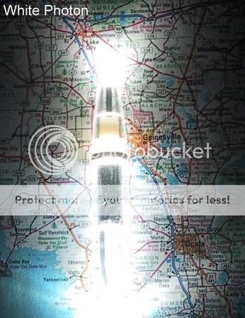
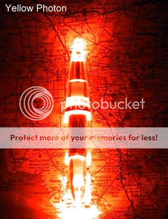
just out of interest I photographed a yellow and White Photon II using the same setup as the above photos.

The Yellow Photon II photo does not do it justice - my digicam set on fixed daylight white balance seems to want to show it as a lot more red than it actually is.

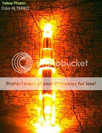
There is an additional ALTERED version of the yellow Photon image where I have used my photo editor to change the color balance (adding more green and yellow) to get a version of the photo to be somewhat like the way I saw the image. This is NOT meant any meaningful direct comparison -
merely that I wanted to see how the image would look closer to the way I saw it with my eyes.

White Photon II
WhitePhotonS.jpg


Yellow Photon II UNaltered ................. & ............... Enhanced Yellow Photon II
YellowPhotonS.jpg
YellowPhotonEnhS.jpg


Even when the yellow Photon was enhanced it did not do well as the combination colors like the red/green = "yellow", or even the blue/green = "cyan". When the photo was enhanced it was on par and may be just a shade better than the mono-Green.

so... perhaps it was "wishful thinking" - or just incorrect conclusions.......

The Lesson I think I Learnt -

Our eyes may see a combination of colors like red and green as "yellow" -
but that is NOT the same as monochromatic yellow -
even if it may look the same to our eyes.

As the photos showed the red/green = "yellow" showed quite a bit more color rendition, than the true "mono-yellow" as in the Photon II (even allowing for the enhanced version of the photon).

The reason is very simply because the combination red/green = "yellow" is made up of red and green lights - whereas the yellow photon is a true monochromatic light.

So although mono-yellow light does excite both the red and green receptors in our eyes - the light when reflected from multi-color printing will not necessarily reflect more colors since the light source is still monochromatic.

Any details we see by a monochromatic/mono-wavelength light will be because the detail has color contrast with the light source.

Mono-yellow still appears to be better in contrast/detail rendition - although it is no better than any other mono-wavelength light at color rendition....

Comments?

[edit: Mar/11/2004 changed photo hosting - ImageStation is no longer hotlinking]
 

highlandsun

Enlightened
Joined
Aug 11, 2002
Messages
607
Location
Los Angeles, CA
Re: perhaps it was

I think you've said all there is to say. One comment I would make is, I know my Kodak DC265 uses a red/infrared LED in its rangefinder, I can see its bullseye pattern as I click the trigger. Probably most cameras do. If you were using autofocus to shoot the red image, you probably were washing out the frequency range that the rangefinder uses. If you had set a manual focus, the pic would probably have come out perfectly fine.

Overall I find your red/green "yellow" photo easiest to distinguish, and all of the photos with just blue or blue+1 color appear fuzzy to me. Remember why red+blue 3-D effects work - you cannot focus on both colors simultaneously. Magenta would drive you crazy over extended time.
 

UnknownVT

Flashlight Enthusiast
Joined
Dec 27, 2002
Messages
3,671
Re: perhaps it was

[ QUOTE ]
highlandsun said:
I know my Kodak DC265 uses a red/infrared LED in its rangefinder, I can see its bullseye pattern as I click the trigger. Probably most cameras do. If you were using autofocus to shoot the red image, you probably were washing out the frequency range that the rangefinder uses. If you had set a manual focus, the pic would probably have come out perfectly fine.

[/ QUOTE ]

Good thought and thank you very much for the comments and input -
but my Canon S100 Digital ELPH uses a white beam focus assist light which I can see well over the other colors including the culprit red - as I said the pen details look as sharp as any of the other photos, and there are some details in the "washed out" parts of the photo that show the focus is actually spot on - so I don't think there was a focussing error - other than the digicam having difficulties with Red.

However I may try to do some "enhancing" with the Red photo to see if I can get it to look more the way I saw it with my eyes.

[ QUOTE ]
Overall I find your red/green "yellow" photo easiest to distinguish, and all of the photos with just blue or blue+1 color appear fuzzy to me. Remember why red+blue 3-D effects work - you cannot focus on both colors simultaneously. Magenta would drive you crazy over extended time.

[/ QUOTE ]

Yes, that's exactly the effect that blue/red or "Magenta" does to me - I do a lot of photography under stage lighting - red/blue combination is attractive for photos - but often my eyes have difficulties just focussing.

However if I recall - aren't the typical 3-D glasses actually red and green?

Thank you also for the confirmation of the red/green = "yellow" combination -
but although it is now obvious to me - it took this experiement to make me realize that red/green = "yellow" is NOT the same as a mono-yellow (as in the yellow LED of the Photon II).

Thanks again for the feedback - much appreciated.
 

highlandsun

Enlightened
Joined
Aug 11, 2002
Messages
607
Location
Los Angeles, CA
Re: perhaps it was

I've seen some Red/Green 3-D glasses, but Red/Blue gives the maximum effect. IIRC the main reason is the two colors are so far apart in wavelength, they diffract differently going through the lens of your eye. So your eye's single lens can only focus on one or the other, not both. But it may also have to do with the physical arrangement of the cones in your retina, I don't recall.

Check this image out - the colors are pure red, pure green, and pure blue. Try to focus on the edges where the colors join. There are no black borders drawn in, just those 3 colors, but as your eyes shift across the image you'll see different shading effects.

colorbar.GIF
 

UnknownVT

Flashlight Enthusiast
Joined
Dec 27, 2002
Messages
3,671
Re: perhaps it was

Highlandsun,

Many thanks for the red/green/blue experiement - indeed my eyes have problems with focussing red/blue contrast - but although red/green doesn't seem to be as severe, it does causes some "pulsing" due to the color contrast.

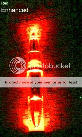
As promised, I enhanced a version of the Red photo -
by adding more yellow and then cyan (the complementary/opposite color to red) and then brightened and added more contrast -
but absolutely NO sharpening or edge enhancement of any kind.

I don't know how meaningful this enhanced version is, and whether any direct comparison with any other colors is valid.

But one can see in this enhanced version of red - that there are sharp details near the tip of the pen and base of the photo where the color looks more "yellow" - and overall the photo doesn't look quite as blurry. Ths is closer to the way my eyes see under red - ie: initially things don't look sharp, but with concentration I can see details - but simply not as well as say mono-yellow.

Red Enhanced
RedXs.jpg


[edit: Mar/11/2004 changed photo hosting - ImageStation no longer hotlinking]
 

highlandsun

Enlightened
Joined
Aug 11, 2002
Messages
607
Location
Los Angeles, CA
Re: perhaps it was

Oh, one other thing to consider is that red light is the most irritating of the visible colors. Green and amber are the least irritating, which is why old monochrome computer monitors were so often green or amber. So part of the problem with focusing on red light is that your eyes really would just rather not. Your eyes get fatigued much faster...

The photo above looks too yellow to me, it's more an orange than a red. Which is fine, it is easier to distinguish features, but it doesn't strike me as a true representation of a red LED's illumination.
 

UnknownVT

Flashlight Enthusiast
Joined
Dec 27, 2002
Messages
3,671
Re: perhaps it was

[ QUOTE ]
highlandsun said:
Oh, one other thing to consider is that red light is the most irritating of the visible colors.

[/ QUOTE ]

I think there are a lot of people who are bothered by Blue light.

Red is certainly jarring as a reflected color - but I think a lot of people are used to red light/illumination - as in night (scotopic) vision preserving environments, and chemical/wet photo darkrooms - I don't know if this is conditioning - I know I'm not bothered by red light other than I don't seem to see that well intitially with it - take a little to get used to red illumination - and under dim red illumination I find it hard to see definition well.

Red illumination is often associated with warmth so for some it may be even comforting.....

Bue may be "cool" but is now often associated with flashing police lights /ubbthreads/images/graemlins/grin.gif /ubbthreads/images/graemlins/grin.gif - it certainly is attention grabbing - but not very good to see by.

[ QUOTE ]
The photo above looks too yellow to me, it's more an orange than a red. Which is fine, it is easier to distinguish features, but it doesn't strike me as a true representation of a red LED's illumination.

[/ QUOTE ]

Yes, I'd agree that the photo is way too yellow and tends toward orange. I guess I should have made it clear - that I was really only experimenting to see if I could enhance the photo to see details clearer - which I think the photo did manage to do to a certain extent.

If one looks at the Enhanced version there are certain details that are now clearer/more emphasized - and with those now identified if one goes back to the Unaltered Red - one can see some of the clear details are actually there - just not as emphasized - eg: the route and numbers by the tip of the pen and the base of the photo. The Enhanced photo has also brought out more details in what used to shadow areas which were not visible on the Unaltered Red photo.

I thought all this was interesting - but canNOT say whether it is meaningful in any practical way.

Thanks for your comments,
 

shankus

Flashlight Enthusiast
Joined
Feb 16, 2003
Messages
1,472
Location
Mojave, CA
Re: perhaps it was

[ QUOTE ]
hank said:
Might work to take a black and white /monochrome photograph of the red-illuminated scene, if you can set your camera to produce that.

[/ QUOTE ]

I'd like to see this, if it is posible with your elph.

Also, does the pen have a brand name on it? I'd like to get one of those.
 

UnknownVT

Flashlight Enthusiast
Joined
Dec 27, 2002
Messages
3,671
Re: perhaps it was

[ QUOTE ]
shankus said:
[ QUOTE ]
hank said:
Might work to take a black and white /monochrome photograph of the red-illuminated scene, if you can set your camera to produce that.

[/ QUOTE ]

I'd like to see this, if it is posible with your elph.

Also, does the pen have a brand name on it? I'd like to get one of those.

[/ QUOTE ]

Sorry, this is late.......

There are no visible markings on the pen to tell me who/where it was made and where one might be able to get one -
I'll have to ask my friend who gave me the pen of the source.

I suspect that it was a pen that many cigarette (Winston - I think) sample givers were using about 3- 4 months ago around the clubs. But I'll ask to be sure.

I'll also take a photo with the Canon Digital ELPH set on black & white of the red LED illuminated map and post it - but it might be a little while ......
 

Quickbeam

Flashlight Enthusiast
Joined
Jun 19, 2001
Messages
4,329
Location
FlashlightReviews.com
Re: perhaps it was

Hmmmm.. This really isn't a review. Locked for now with decision pending on what to do with this thread.

OK.... moving to Cafe.
 

Canuke

Enlightened
Joined
Aug 31, 2002
Messages
823
Location
Stuck in California again
Wow, much information

I'm glad I stumbled into this thread, there's a lot here I'm interested in.

sez hank
The blue end also triggers the new "fourth photoreceptor" chemical recently discovered, the one that particularly changes the body's day/night timing and melatonin synthesis

Well now I need to read up on that. I am convinced that whatever this supposed mechanism is, does not work in me. That or my body is "melatonin deaf". It "wants" to be nocturnal so bad, it isn't funny. When on a normal work schedule, getting up in the morning is always laborious, and it moves three or four hours forward at first opportunity (sleep in to 1PM on Saturdays, average. Now that I freelance, I'm drifting around the clock, sliding to nocturnal until I "push" myself around the clock... average effective circadian rhythm of 26 hours. Who needs a jet? /ubbthreads/images/graemlins/rolleyes.gif

sez UnknownVT
So although mono-yellow light does excite both the red and green receptors in our eyes - the light when reflected from multi-color printing will not necessarily reflect more colors since the light source is still monochromatic.

That's why I'd like to see what the world looks like when illuminated with a blue/yellow combination. If the yellow excites red and green cones, the light should appear "white" to the eye, but the actual lack of red should make things look really strange. I've been thinking of suggesting to CGI software manufacturers that they should switch rendering engines over to a wavelength/intensity basis instead of RGB in order to model those aspects of the real world better.

sez highlandsun:
Oh, one other thing to consider is that red light is the most irritating of the visible colors. Green and amber are the least irritating, which is why old monochrome computer monitors were so often green or amber.

That is contingent on the eyes of the viewer. For me, red is better because I'm mildly myopic. I can still focus red at a distance, but I can't sharpen up green past 15 feet and blue is a blob at 7 or so. Someone whose eyes lean towards being farsighted (who holds a book far away to read it) would see the opposite problem, because their eyes work harder to bend the red rays to sharpness than the blue ones.

Also, certain CCD's most notably the ones in some Sony video cams like my TRV900, have an inherent problem focussing red, for reasons not entirely known.

Lastly, I have that same pen, I picked it up at the Rose Festival in Portland last year for $7.
 

snakebite

Flashlight Enthusiast
Joined
Mar 17, 2001
Messages
2,725
Location
dayton oh
Re: perhaps it was

mendelsons had those at computerfest for 2.99
look at meci.com
[ QUOTE ]
shankus said:
[ QUOTE ]
hank said:
Might work to take a black and white /monochrome photograph of the red-illuminated scene, if you can set your camera to produce that.

[/ QUOTE ]

I'd like to see this, if it is posible with your elph.

Also, does the pen have a brand name on it? I'd like to get one of those.


[/ QUOTE ]
 

UnknownVT

Flashlight Enthusiast
Joined
Dec 27, 2002
Messages
3,671
B&W Photos of Red illumination

Here is the B&W photo of the Red LED illumination from the pen.

But as control and comparison -
I also took the following:

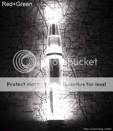
Red+Green (="yellow") combination
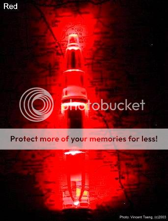
Color Photo of Red
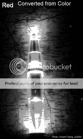
Converted from color to B&W (greyscale) of Red

B&W of Red.....................& ........................... Converted from Color of Red
RedBWs.jpg
Red3Sbw.jpg

B&W of Red+Green......................&............................. Red Color
redGreenBWs.jpg
Red4s.jpg


From these photos

Red+Green (="yellow") combination gives the most details and better contrast (which is not surprising, since this combination seemed to do well in the actual color shots above)

B&W of Red - actually did pretty well - it is kind of what details I can see by eye - in B&W the contrast seems quite a bit better than real life under red.

Converted Red - this was the color shot shown in 4th (color) photo that I converted to B&W/greyscale (ie: got rid of the color) - this is probably the closest that I would see under red light for detail - as I said before, it takes me a little time to get used to red light to see details. This Converted photo is not quite as good as the straight B&W version of the Red - but it is still a LOT better for details than the actual color version it was converted from.

Red Color photo - this is no better than the previous version in the opening post - if not a tad worse visually - but as we can see it is not a focussing or camera/subject movement problem since the converted to B&W/greyscale image shows very sharp details....
it HAS to be the color red itself causing imaging difficulties.

Like I said previously I am at a loss to explain this very poor definition under red in the color shot - I really do not think it is a chromatic abberration problem with the lens - as the numerous detailed tests of this very popular camera, and my own usage for over 3 years (and archiving of over 31,000 photos) have not revealed such a drastic chromatic abberration problem under "normal" photographic conditions.

So here are the results presented for whatever it's worth....

COMMENTS please?

[edit: Mar/11/2004 changed photo hosting - ImageStation no longer hotlinks]
 

highlandsun

Enlightened
Joined
Aug 11, 2002
Messages
607
Location
Los Angeles, CA
Re: B&W Photos of Red illumination

I'm viewing all these photos on an LCD monitor. The red photo has almost no detail when viewed straight on, but when I tilt around and look from various angles I can see gradations in shading and details that are readily apparent in the other photos. As such, I guess part of the problem is just limitations in the display hardware. I haven't looked at it on a CRT yet, but the fact that the converted-to-grayscale image has the detail preserved indicates that the detail is present in the image data, it's just not being rendered well enough on my screen.
 

UnknownVT

Flashlight Enthusiast
Joined
Dec 27, 2002
Messages
3,671
Re: B&W Photos of Red illumination

highlandsun,

Once again many thanks for the response.

Interesting about the monitor perhaps being incapable of displaying details under red. I had never thought of that.

I don't have a LCD screen to be able to determine this - but on my regular CRT screen the red color photo(s) all look blurred regardless of the angle viewed from - which, as I said I was very surprised at - as far as I can tell CRT screens don't/shouldn't(?) have difficulties displaying red details - otherwise I would have thought the pretty obvious pheomena would have been well documented - and any photo of red illuminated detail will be said to be UNrepresentative.

I wonder if ANYONE on any monitor can see good details in the colored red photo(s) (either in the follow up post or the original opening post) - as well as either the B&W photos of red or the Converted Red (from color to B&W)?

I am still somewhat lost to explain this effect.
 

PhotonBoy

Flashlight Enthusiast
Joined
Mar 11, 2003
Messages
3,304
Location
Annapolis Valley, Nova Scotia, Canada http://tinyu
LED Colors and Vision

I was out last night for a walk and observed that my 2 LED 'white' flashlight seemed to underperform and I got to thinking....

Outdoors: There are lots of browns (i.e. red) and greens but not many naturally blue objects at night. Hence, the LED's apparent underperformance.

Indoors: There are lots of man-made objects, including white (paper, clothing) and blue colors (wall paper, upholstery, etc.), so the apparent performance is better.

If true, this would indicate that outdoors at night, yellowish incandescents would tend to work best, since their spectrum is shifted to the red.

Indoors, the blue-shifted LEDs would tend to work better from a physiological perspective, but emotionally, I think that incandescents seem warmer and cozier.

Maybe combining an amber and white LED in an outdoor LED flashlight (e.g. bike light) would work better.

Also, further advancements in phosphors will tend to improve 'white' LED color balance.
 
Top