It is these over/undertones that allows the human eye to render colors better with ambient sunlight than artificial lighting which is traditionally more mono-tonal, centered more closely around a fundamental color temperature.
My understanding is that, in order to see green (or red), you need green (or red) photos flying around. Otherwise you will see the right shade and a wrong color.
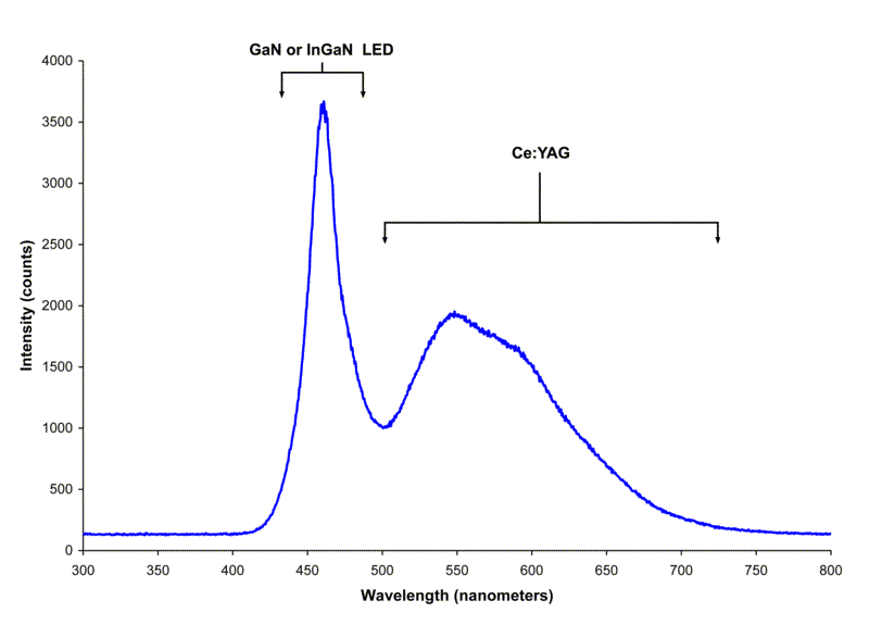
At 500 nm (green) there's a dip - LEDs are often weak in green light. And it trails off in red (the right side) - again, a weak point at red. Fewer red and green photos makes it harder to see these colors as colors - they'd be shades of less-red or less-green. The extreme case is using a red light to read a colored map - the worst thing ever, where every color and line will be a shade of black or red.
Everything is yellow! Argh! Notics that snow, pavement, yellow road lines, red, green, blue, silver, and black cars are all just different shades of the same color. The color of the green bus stop is barely discernible because of blue light from the sky. That's low CRI.


 .
.