Hi guys,
I decided to take some pics to see if they illustrate a difference in color rendition. It was an informative process for me in and of itself. I set my Nikon D70 white balance on "sunlight". I let the shutterspeed vary as the camera sought a reasonable exposure. These comparisons are not about relative intensity or brightness of the different light but about the color captured.
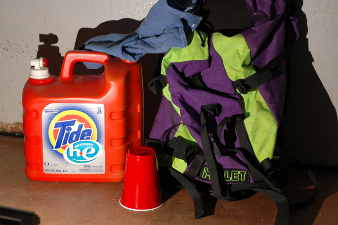
I have a backpack that is a fluorescent light green and strange purple nylon. I have noticed that this purple is all over the place under different light sources; a "problem purple".
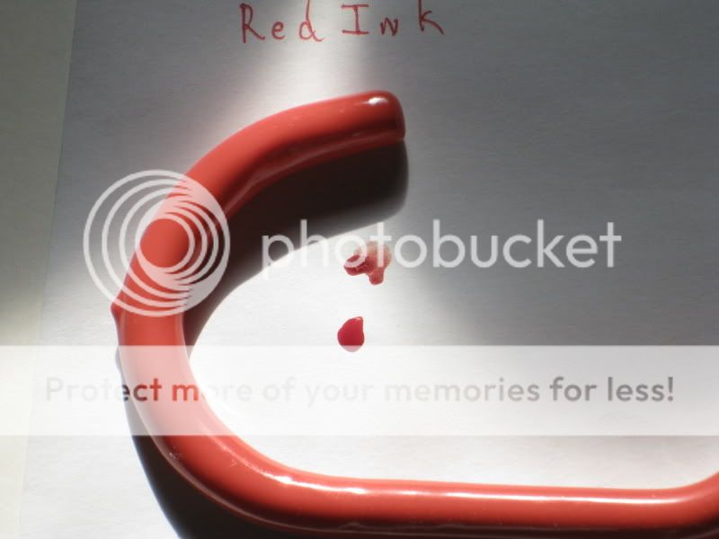
Camera on tripod and shot in the garage, first up is the SunDrop:
Now on my computer screen, these colors all look good and the garage door in the background is about the proper tint of white.
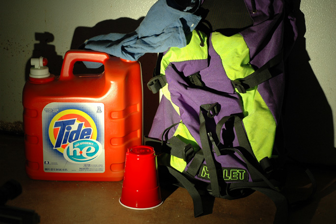
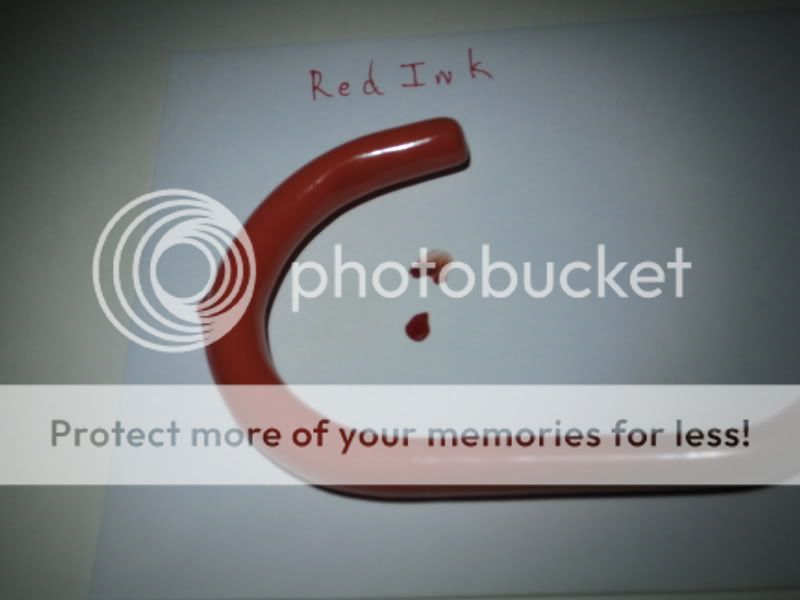
Next up is the same scene as illuminated by a Seoul High CRI P4 that is in a custom A2 dumb head on L1 with F04 beam shaper (a mouthful in itself):
I think the colors here are also good but the purple is not quite "right" and the wall tint is a bit off. Incidentally, to my eye, there was much more of a warm tint and awareness with the Seoul than the Nichia in the SunDrop but I think this would be "filtered out" by the brain in no time.
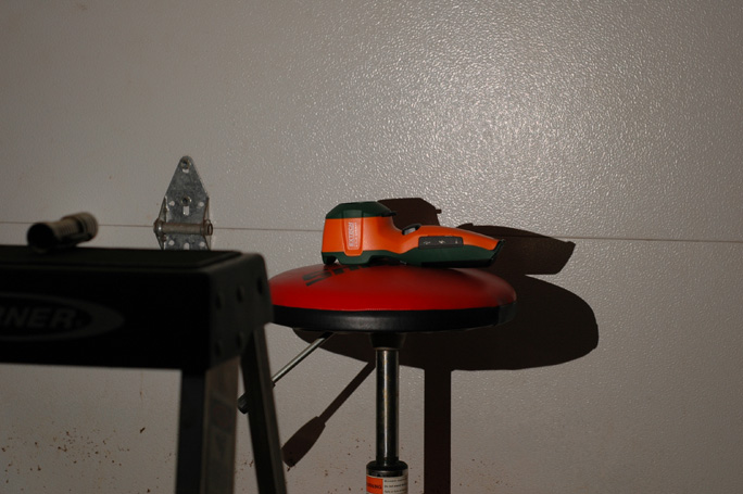
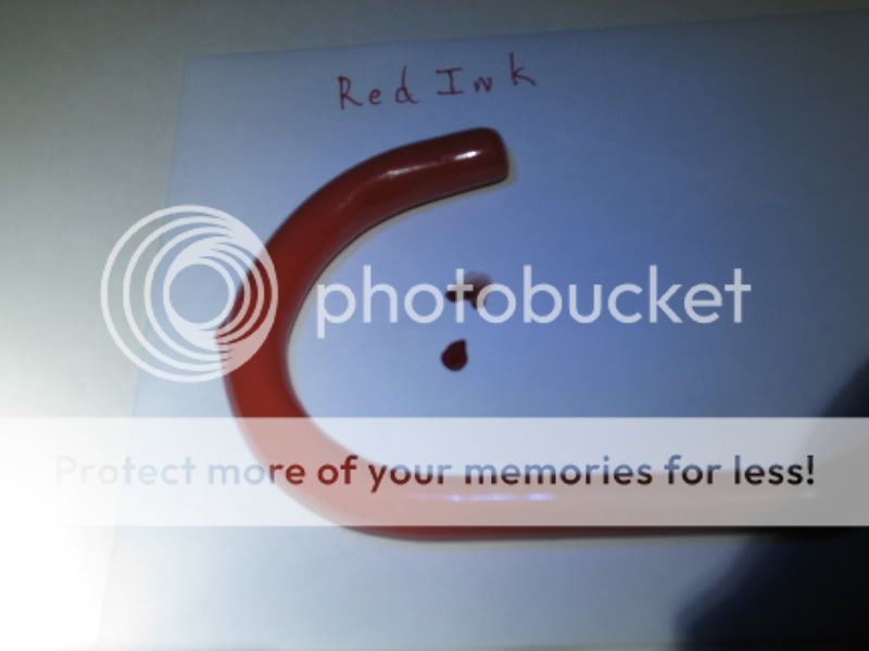
Next up is the scene as illuminated by a Mule sporting a Cree CR-E of high color temp:
Now the lime green or whatever it would be called has the best "snap" in this image and the reds and orange look good but the purple looks blue to me now and not right.
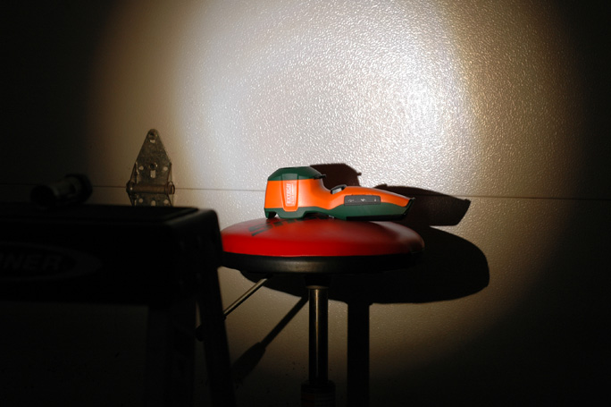
Finally, the same objects illuminated outside in
indirect sunlight and little shaddow:
Now we have some potential problems here. For starters, I noticed while viewing these images on my camera display that the daylight image of the purple was simply blue!! Now on my laptop display it does seem more true to life but somewhat washed out.
The camera makes color corrections and the software on my laptop effects the color as well as the LCD monitor itself. The compression software has its way with these colors as well. I have no idea if you will be seeing the same colors on you end as I see here while composing this. Our eyes and brains are different too.
I can state that to my eye at the time of taking the shots and even now while viewing the images in this composition that the Nichia High CRI LED in the SunDrop provided the best color rendition to my eyes and was most in harmony with what I see viewing the same objects under sunlight. Is this significant? Well we all can identify the back pak and light blue shop towel and botlte of tide and red cup in all of these images. The only false perception I had during the process and now in viewing the images is in regards to the problem purple. I would not identify it as purple under the Cree LED either in person or by the image I now view. I might guess it is purple if a hint were provided.
I would guess that those who love incandescent light sources probably have problems in proper identification of colors in the violet to green range. Those who prefer LED light sources probably have problems in the greens and reds. Are they serious problems though? If color recognition is critical then color rendition is likely important. Duh.