This is pretty subjective -
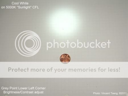
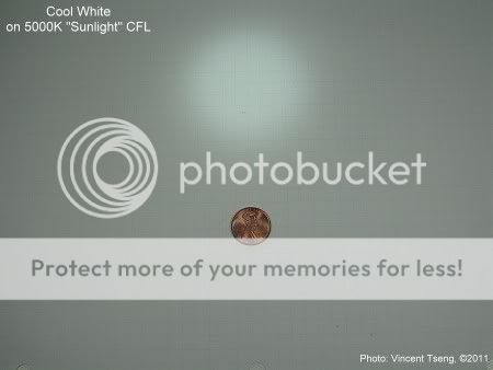
the cool white ought to be closest to daylight D65 - which is color temperature of 6500K - that is supposed to be noon daylight with clear blue skies - but I find it slightly blueish
Sunlight is supposed to be 5500K ("D55" if it exists - the closest standard is D50 @ 5000K)
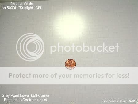
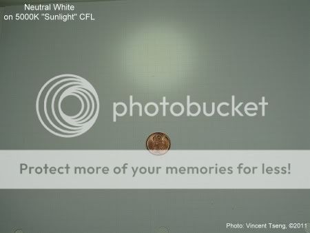
the current batch of Neutral Whites seem warmer than D50 (I have CRI90 D50 fluorescent "Sunlight" tube to compare) - but the current Neutrals seem close enough that I actually on first sighting thought 4Sevens had sent me Cool White instead -
so in this batch (and I freely admit my bias) the current Neutral White seems closest to D50.
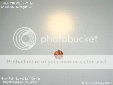
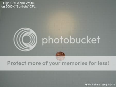
the Cool white definitely shows as too blue and the High CRI (warm) is definitely too amber/yellow.
If I have some time I'll take photos of these lights on white paper that's illuminated with D50 lighting.
I did both GE 5000K "Sunlight" CFL (Compact Fluorescent Light)
and GE 6500K "Daylight" CFL -
these bulbs may not have color temperatures accuracy to the least significant digit
- but are probably "good enough" for our comparison purposes -
Another note, if it means anything - both the CFL's have CRI=82
(but more than likely very different deviations from "perfect" to any of the LEDs)
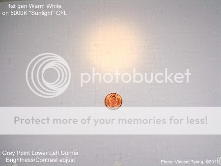
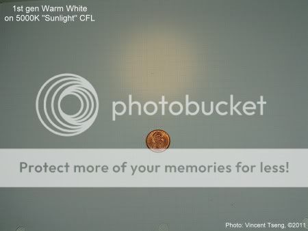
Flashlights on paper illuminated with -
GE 5000K "Sunlight" CFL
GE 6500K "Daylight" CFL
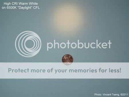
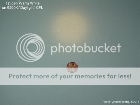
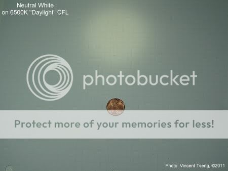
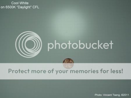
These are good for seeing how the lights differ from reasonably well known standard color temperatures of 5000K (D50 - tiny bit warmer than "sunlight") and 6500K (D65 - "Daylight")
The exposures were auto as-is with Fixed Daylight White balance -
NO post processing adjustments for tint or color.
I then did some post processing to try to get the pictures to look like I saw them - the main problem was in balancing the flashlight hotspot (which was much brighter) to the surrounding areas illuminated by the CFLs.
Details I selected a grey point (should be neutral grey) near the lower left corner - the furthest point from the flashlight beam - so ought to be the CFL light only - then did minor adjustment to the brightness so they'd all look similar in brightness. Therefore there is some color/tint adjustment (but it is everything in the whole picture) due to the grey point selection - I was hoping that this would be an "idealized" way to see the pics, as the "white" paper is supposed to be tint/color free - as it was, I don't think I was that successful - but I present these without any further excuses -