Puny LED flashlights (Not!) + COLOR RENDITION Comparison

soffiler

Enlightened
Joined
Feb 15, 2006
Messages
522
Location
Cranston, RI
...Then we tried the amber filter and found that our favorite setting was full power on the amber light and medium power on the white light. This did produce a more 3D image to our eyes, but I would not call it dramatic. The biggest difference was how it seemed to make everything sharper, easier to focus on, and a little higher contrast. Leaves and evergreen bows stood out from the brown tree trunks. Dry grass suddenly showed a lot more detail, and the scene was also brighter, as you'd expect....

I find it interesting having just read VT's post quoting that yellow light provides the best focus for the human eye. That's exactly what We experienced when we added the yellow light to the mix: colors could still be distinguished but everything just seemed to snap into better focus.


Perhaps it's time to drag out this dissertation on "selective-yellow" lighting for automobiles:

http://www.danielsternlighting.com/images/S-Yellow.pdf
 

robm

Enlightened
Joined
Nov 17, 2004
Messages
307
Location
North West UK
Firstly - cracking thread UnknownVT :thumbsup:

But just something that struck me when looking at the map and Macbeth comparisons:

What light source does the scanner use, as this is the reference (and gives good real world colours to your eyes)?

Thanks
 

Daekar

Enlightened
Joined
Mar 23, 2007
Messages
837
Location
Virginia, USA
Perhaps it's time to drag out this dissertation on "selective-yellow" lighting for automobiles:

http://www.danielsternlighting.com/images/S-Yellow.pdf

I actually thought of that this morning on the way to work! I'd be willing to bet we've hit on the real reason why they're good. Nice motorcycle by the way, I love the GS series... when I test-rode an '06, I was grinning like an idiot the whole time. :D
 

UnknownVT

Flashlight Enthusiast
Joined
Dec 27, 2002
Messages
3,671
....BTW isn't sRGB the web standard?

You're right, I was wrong here -
I work in whatever the default color space that both my digicam and my photo editor works in JPG - which is sRGB -
and there is no color shift that I can see when displaying the picture using the Windows Viewer, IE, FireFox or any of my photo editors -
I am pretty fussy about my photos so I think I would see a color shift - especially for the reproduction of the Macbeth chart - that's why I had a control white image.

My apologies for this mistake - that's from typing in the late late night/early hours.

I'll edit to correct my post to reflect that I do work in sRGB color space.
 

UnknownVT

Flashlight Enthusiast
Joined
Dec 27, 2002
Messages
3,671
What light source does the scanner use, as this is the reference (and gives good real world colours to your eyes)?

The scanner is an old cheapo HP ScanJet 2100C (bought 2001) - the light source is a light strip - can't be certain - but it kind of looks like a daylight fluorescent.

However the scanner is pretty accurate - I've used it for years now for most of my web stuff and yes, the scan of the printed color chart does look like the physical print in real-life.

I suppose I should have also taken the chart in real daylight as one of the controls - but it was night and the direct (built-in) flash shot I took had way too much reflection to reproduce correctly.

However I just realized that I did take the chart in good sunlight - but as part of my socks adventure (post #82 ) - it was very tilted in perspective - so I correctd the perspective tilt, cropped the photos, and reproduce them here with the original scanned control white reference -

McbSunDayB.jpg
MacbethScan.jpg

McbSunAWB.jpg
MacbethScanN.jpg


From these samples I would say the Canon A610 I used has slightly more compressed dynamic range in these shots than the scan. Despite that it is also punchier - as with most consumer digicams - the red in C3, greens in C2 and B5 all appear brighter. There is also a noticable jump in blue C1 and C6.
 
Last edited:

robm

Enlightened
Joined
Nov 17, 2004
Messages
307
Location
North West UK
Thanks for checking that UnknownVT - I just wanted to clarify that the 'control' was a realistic one.

The interesting point is that the light source closest to 'realistic':
However the scanner is pretty accurate - I've used it for years now for most of my web stuff and yes, the scan of the printed color chart does look like the physical print in real-life.
is a 'daylight' fluorescent, which the comparison shots indicate is also closer to the LEDs than incandescents so we sort of have, in your tests, in descending order:

daylight (which I assume is what we are aiming for with regards colour rendition)
fluorescent daylight/scanner
LED
incan

I also agree with a statement you made earlier regarding the claims that incandescent look more 'natural':
When it is dark (i.e. when we normally use flashlights) our eyes are used to either faded sunlight, or domestic incandescent lighting, the sudden introduction of a small area of 'close to daylight' looks very wrong, now if we could gradually fade this in (in about the time taken from first light/dawn to midday) - it may look more natural :D
 

UnknownVT

Flashlight Enthusiast
Joined
Dec 27, 2002
Messages
3,671
The interesting point is that the light source closest to 'realistic':
is a 'daylight' fluorescent, which the comparison shots indicate is also closer to the LEDs than incandescents

Well the scanner uses software to reproduce the best color accuracy.
The scanner has the advantage of a "known" light source to correct - whereas say the AWB on a camera is working from the given scene which might have a real color bias anyway.

(the following is not aimed at you - or anyone in particular -
it's just a general overview)

Anyway like I said I am only doing and intend a visual comparison - my methods may not be the absolute scientific - but then none of the equipment, software used were measuring instruments - even though they may well be more accurate than average.

The point is just about anyone should be able to reproduce my results with commonly available and inexpensive equipment that most people probably already have - at least close enough so that the discussion/results are not going to deviate that much from what has already been presented.

We are not really looking at subtle differences here -
I mean who in their right minds/eyes can deny the huge yellow/orange bias of incandescents - that is what I was showing initially.

So in context any use of manual white balance, color spaces, or LAB mode is just not going to make that much difference, if any, to this ad-hoc experiment -
which was always meant to be a visual comparison......and not a scientific measurement.
 
Last edited:

D MacAlpine

Newly Enlightened
Joined
Nov 10, 2005
Messages
167
Location
London (UK)
Well! That is helpful information, and begs other rhetorical questions:
1) Will warm-white emitters display any detectable improvement in vision sharpness when compared to say, cool or cold whites?
2) Are yellow-tinted sunglasses better for discerning details afar?
3) Is this the reason that roadsigns with a blue background are harder to read far away than an equivalent green sign?
4) Does this mean that reading by red light will give you eye strain?
5) Why do we seem to always pick the two worst colors, blue and red, for alarm-clock faces? (I can BARELY read the blue clock on the front of my computer from across the room... and no, it's not just me...)
6) Is that why the new blue LED-bars for police cars always look more like bright blurry points of light rather than bright sharp points? (It makes them look bigger and are more "visually magnetic" IMHO)
7) Does that mean it's better to have a yellow motorcycle than a red or blue one, if you're interested in being visible?

All out of questions for the moment...

EDIT: I'm back with more:
8) Does this mean we have a definite and irrefutable reason to claim that HID bulbs with color temperatures of 4200K/4300K produce more useful output for the same number of lumens than those with 6000K+?
9) Is this why the lines in the road are yellow? (At least the centerlines are in the US - I can't speak for the rest of the world as I haven't gotten a chance to visit anywhere else but Canada and Bermuda)
10) Does this imply that there might be visual advantages to developing a yellow stain for use in microscope slides?

I'm sure more will occur to me...

I'll have a go at a couple of these, Steve has already provided my answers or better to the rest.

7) Yellow is always going to be the best colour for overall high visibility, but I think that is to do with the way it contrasts and clashes with the background rather than visual acuity (obviously other colours would be better against a yellow background such as a field of oilseed rape in flower!). From what I have seen high visibility clothing, generally "dayglow" yellow with retroreflective stripes, isn't so popular in the US as it is over here. Take a look at this video for an idea of the effect. For it to work well it does need to be a really bright yellow though.
Two more points; my bike is also (mostly) yellow and I believe that the problem with motorcycles is not that other road users don't see them - but that they either don't look in the first place or fail to react to what they have seen. The proof of this is how much more reaction you get from drivers if you look like a cop (the right bike in white, white helmet, black leathers etc.) in comparison to being equally or more visible, but not triggering the "it's the law!" reflex in them.

9) Centre lines are white over here and in much of the rest of the world, where they're present at all, sometimes including crushed glass to improve grip and add a bit of retroreflectivity. We have yellow lines by the kerb for parking restrictions. Again yellow will tend to contrast best against a dark road surface, but I don't think it improves much on white in the situations where you can't see the road markings (light reflecting off wet roads etc.)

Edit: I've just been out in the car, in the dark, and I can say now that the yellow lines we have on the roads definitely do not show up as well under car headlights as the white lines. These are old lines on side roads with the centre (white) markings being well worn. Just another useless snippet... (need to shut up now, must NOT get drawn in on road markings or yellow jackets.......)

10) From what I understand the stains used in histology are selected for their ability to colour certain types of tissue or structures selectively. I believe that they already use filters to increase contrast, so I think that the answer to this one is no.

Apologies to Vincent if we're adding another line to his map of places this thread has drifted off to!
 
Last edited:

UnknownVT

Flashlight Enthusiast
Joined
Dec 27, 2002
Messages
3,671
7) Yellow is always going to be the best colour for overall high visibility, but I think that is to do with the way it contrasts and clashes with the background rather than visual acuity
Apologies to Vincent if we're adding another line to his map of places this thread has drifted off to!

Not at all - these are valuable points for discussion.

Many years ago when I commuted on a bike - that is a pedal bicycle - and for secondary (high) school - I read a pamphlet from the AA (not Alcoholics Anonymous :eek:oo: ! - but Automobile Association - in Britain - equivalent to AAA in USA) that black - yellow gave the highest color contrast combination - I was surprised because I was taught in art classes white was the "opposite" to black - but nevertheless this was the information I retained - and eventually come to confirm for myself.

Notice most internationally recognized caution/hazard signs are black symbols on yellow - and for Brits even the AA's own logo is black on yellow.......

So that's color contast -

But using a light of a particular wavelength/"color" - we may have to allow might different -
Just as we know (or have discovered) that the "camera never lies" is not really true - as most of us can see well enough and recognize colors pretty well under incandescents - even though compared to real sunlight - tungsten/xenon lighting is distinctly yellow/orange - and with a few exceptions mostly cause people problems when trying to distinguish shades of blues or seeing yellow on white.

Further - some might be equating say yellow LEDs with incand's yellow -
nothing can be further from the truth - color LED's are mostly a single wavelength of light - whereas incands are a pretty full spectrum of visible light - but with a lower color temperature or yellow/orange bias - so the experiments of adding red, orange or yellow LEDs to the mix of white LEDs - only adds to the peak wavelengths of those respective LEDs - and does not really help even out or the "accuracy" of the overall combined spectrum.

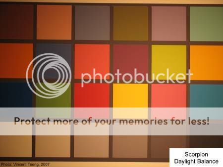
I'll just repeat the shots from an incand and orange LEDs of the Macbeth color chart here - and see the difference
Scorpion Daylight Balance ....................................................... 2x Orange Fauxton LEDs rendering -
Mb_ScorpionDayL.jpg
McB_Orange.jpg

- the orange LEDs show only a monochromatic result - whereas the incand albeit very yellow/orange biassed - still shows color in the patches - it would do not good whatsoever even if we adjusted the white balance for the orange LEDs - whereas, as already seen, the incands when white balance adjusted can reveal almost daylight like results.........

There seems even some confusion that direct sunlight is "yellow" and equating that to incands - NO, NO, NO! - sunlight's color temperature is about 5,500K wheras even the best xenon incand cannot exceed about 3,200K which is significantly lower - go back to Post #52 where there is literally daylight balanced shot of the Macbeth color charts showing the Scorpion next to the sunlit shot....
(oh, I'll just show them here....)
Mb_ScorpionDayL.jpg
McbSunDayB.jpg


So there is a difference between light wavelengths/colors and colors of objects as seen by our eyes -

I do think (and these are only my thoughts) it is a combination of color contrast, and the fact we have better acuity with yellow wavelengths of light -

I'll go back to my anecdotal (or maybe even "empirical") evidence that the light shone through Serengeti Drivers sunglasses - which I (and many) know enhances visual acuity and contrast - looks remarkably like the shots from the incand xenon Scorpion - so no wonder many of us see better with incands outdoors.......
McB_RB100LowAdj_Serengeti.jpg
Mb_ScorpionDayL.jpg
 
Last edited:

norman$

Newly Enlightened
Joined
Oct 14, 2005
Messages
4
Hey folks-

I occasionally lurk around here, and may never have posted before. However, there are a few things I thought I might be able to add for consideration. I've paid a good deal of attention to color perception partly because of some work I did in computer graphics and displays vs printed colors (like some others I saw) but also my interest in genetics, physics and colored gems- as will become clear.

First is that the human eye not only has the issues with focusing blue (and to a lesser degree, red) as described, but also has significantly different sensitivities to different wavelengths of light. The eye is much less sensitive to blue and red than mid-spectrum light (yellow). That is, if I have a nice, monochromatic 650 nm red light source putting out X watts of light energy, another at 450 nm, and a third at 530nm, the 530 nm yellow will look will look much brighter than the blue and red even if one can prove that the amount of light put out by each is the same.

BTW, the focus issue is that most materials will bend light different amounts depending solely on the wavelength- that's why prisms give rainbows. (in optics e.g. telescopes, camera lenses, and microscopes, this results in rainbows around things if uncorrected- when corrected the lenses are "achromatic") But different materials do it more than others- diamonds and certain other materials do it quite strongly, while crystalline pure quartz does is very very little (if you had 2 prisms, the quartz would give a very narrow rainbow, while the diamond a very broad one). In gems it's called "dispersion", and is the primary reason diamonds are so sparkly- you get lots of different colors out compared to e.g. quartz or sapphire. Good simulants like cubic zirconia or "moissanite" reproduce this quite accurately, some older ones (rutile, strontium titanate) are TOO sparkly.

The second is that the light interacts with various objects and their chromophores differently- a fine example of how funny absorption spectra of objects interacts with differing spectra of light sources and the uneven sensitivity of human vision to various wavelengths all come together to give color-changing gemstones: alexandrite (a rare chrysoberyl), and rare garnets, sapphires, and other minerals will drastically change their apparent color depending on the light source- usually shown as daylight vs. incandescent (or fluorescent vs incandescent). (in these cases the chromophore in question is chromium and/or vanadium stuck in the otherwise colorless crystal lattice... except garnets, which often have intrinsic color... and the compounds generally absorb mid-red and green but not long red or yellow) .

The same thing happens with lots of other subjects but is less apparent most times- but more than one author above noted that they saw lots of different colored leaves when the light changed from the yellowish incand to the blue-heavy LED. THis is really very, very common but hard to notice because people perceive only what they pay attention to- e.g., very little of the overall stimulus, and then its usually just a comparison between A and B, not any absolute measurement.

And different people have different light receptors and do in fact have different color perception- the most obvious is colorblindness- usually the lack of one of three color-sensitive compounds in the eye. Even though I con't perceive what you or someone else does, I can perceive and report that I can tell the difference between yellow, green, blue, and red in all the usual shades and intensities. Colorblind people simply cannot distinguish between certain shades of red and green or blue and yellow. BUT there are subtler differences, too- the eye has red, green and blue- absorbing compounds, and some people have different versions that absorb slightly differently- the light-absorbing compounds of the retina in some people absorb at different wavelengths even if overall they still allow for "normal" color vision by most tests. To such people, the colors of objects around the variant vision compound will appear distinctly different from "normal" people in that object X will look more or less different than object Y of similar hue and saturation. So a "normal" person would say that object 1 is closer than X to Y, whereas variant vision would cause the viewer to say that X is closer in color to Y than object 1.

Weirder still is people who have more than the usual three vision compounds- they can distinguish between more colors than we can because of subtle differences in the spectra coming from objects, usually in the green range (one lady could readily distinguish between paint and grass of the "same color" and even used different words when describing them, saying the grass was more like a nearby fence painted yet a third color of green that to the author did not seem very close to either the sample green paint or the grass). Birds generally have 4 such color receptors and in humans the condition is called tetrachromatism- google it for more discussion.


For gems, this all means that even non-color changing stones will have a different perceived color depending on the light source as well as on the viewer. Usually it doesn't really matter- but the next time you see a nice blue (real) sapphire, funny colored garnet (anything but pure "red" or "green"), try to view it under different light sources because it might look great (or crappy) under the halogens in the store, but look great in the fluorescent lights of the mall (and your work place), and in natural sunlight, still different depending on the time of day. I've got a few neat color changing garnets, and they vary from golden/plum to blue(ish)/red. Alexandrites (none of which I can afford) go from green to red, but other crysoberyls go from yellow to green. (all ordered sun or fluorescent vs incandescent) Neat, neat stuff.

So... It really is in the eye of the beholder. All you can do is get a light and see if it is useful under your preferred conditions.
:cool:


Sorry for the long winded exposition, but I have an academic background (but by now, you're asleep I bet- I would be)

Ciao-

Nominally, Norman$.

 

hank

Flashlight Enthusiast
Joined
Apr 12, 2001
Messages
1,561
Location
Berkeley CA
Norman$, best post yet on a subject I find fascinating, I hope you'll write more, or point to elsewhere if you're, for example, one of the scienceblogs writers. As the big push comes to phase out incandescents in ordinary home use, the differences in color (emission spectra as well as color temperature) of the new lights have started to to attract a _lot_ of attention. Your post helps a lot.
http://www.nytimes.com/2008/01/10/garden/10lighting.html?ref=garden
 

UnknownVT

Flashlight Enthusiast
Joined
Dec 27, 2002
Messages
3,671
FWIW - It was a nice sunny day today - so I went outside to take some Control Sunlit shots of both the Map and Macbeth chart ~3:30pm EDT - Atlanta, GA, USA -

Macbeth - Control Sunlight shots - compared to Scanned Control White Ref -
McB_Sun_DayBE.jpg
McB_Sun_AWBE.jpg

MacbethScan.jpg
MacbethScanN.jpg


Map - Control Sunlight shots - compared to Scanned Control White Ref -
map_Sun_DayBE.jpg
map_Sun_AWBE.jpg

WhiteRef2.jpg
 
Last edited:

soffiler

Enlightened
Joined
Feb 15, 2006
Messages
522
Location
Cranston, RI
...Sorry for the long winded exposition, but I have an academic background (but by now, you're asleep I bet- I would be)

Superb first post, norman$ ! I sincerely hope you stick around and continue to share your knowledge with us. Your academic background shows more than a little, and your grammatical skills are excellent. No snoozing here.
 

UnknownVT

Flashlight Enthusiast
Joined
Dec 27, 2002
Messages
3,671
So in context any use of manual white balance, color spaces, or LAB mode is just not going to make that much difference, if any, to this ad-hoc experiment

Earlier discussion pointed out that using simple deSaturation of an image maybe different from splitting out and using only the Lightness Channel for lumiance information.

This however required using LAB mode color space in PhotoShop - I don't have PhotoShop -
so since then I've been scrambling to find a means of splitting out the Lightness Channel to compare to the desaturated imges posted here.

Then I realized that Paint Shop Pro (often called the poorman's PhotoShop) does not have LAB mode - but actually can split out the Lightness channel.

This I did, and present the Lightness channel here next to the original numbered deSaturated Macbeth Scan
MacbethScanLightnesXN.jpg
MacbethScandeSatN.jpg


I think it's hard to see any difference - if any - between these two images
- however I actually used the eyeDropper tool in my photo editor on the images to read/measure the gray value
(in the case of the deSaturated image - it still thinks it's RGB - so it has RGB values - but R=B=G - values are the same) -

I checked the center of the 4 central patches -

...... DeSat ... Lightness
B3 ... 141 ....... 142
B4 .... 87 ......... 88
C3 ... 112 ....... 112
C4 ... 166 ....... 166

So yes, there is a very slight difference -
but surely not enough to make any difference to the visual comparison.......?
 

hank

Flashlight Enthusiast
Joined
Apr 12, 2001
Messages
1,561
Location
Berkeley CA
I can't imagine wanting either a Solux or Ott as a flashlight.

Solux is incandescent, meant for color balance in museums as I recall.
Ott is a strange fluorescent with enhanced ultraviolet emission.
 

UnknownVT

Flashlight Enthusiast
Joined
Dec 27, 2002
Messages
3,671
I can't imagine wanting either a Solux or Ott as a flashlight.
Solux is incandescent, meant for color balance in museums as I recall.
Ott is a strange fluorescent with enhanced ultraviolet emission.

Thank you - you have just illustrated a point.

Both these bulbs claim much truer color balance (daylight like) than any flashlight - either LED or incand.

But probably no one would be interested in adapting them in a flashlight - nor would anyone design a bulb to have the same spectrum as these for flashlights......

Why? because color accuracy/CRI etc are still pretty low on the scale of things compared to brightness for flashlights.

Now that we see LEDs surpassing most incands for sheer brightness - we may see a slow down in the pursuit of brightness (which I doubt :p - as a lot of the LED development is NOT for flashlights - but for commerical and domestic lighting)
which means there will be more research in color accuracy
and hopefully deliberate color spetrum balance to enhance vision for specific tasks.......
that means we will probably eventually see these in flashlights and benefit.
 
Last edited:

jzmtl

Flashlight Enthusiast
Joined
Dec 4, 2006
Messages
3,123
Location
Montreal, Canada
On the original topic of puny led lights, if you want to laugh, go to bottom of LED forum, change display setting to from beginning, then go to last page, which should go back to 2000 or so. Look how little interest there is in this forum, and how puny the little led lights are.
 

srvctec

Flashlight Enthusiast
Joined
Feb 5, 2005
Messages
1,120
Location
Central USA
Re: Puny LED flashlights (Not!)

I own only two colors of socks: dark navy blue and black. Under sunlight they are easy to match. Mostly, I neglect to sort them until I'm getting dressed in the dark. I find that LED lights (from 5mm to M60 Malkoff) are of no help in sorting the blues from the blacks. My SF E2O is my preferred sock matching light as it clearly shows the difference between blue and black.


Interesting. (I just came across this thread- so a little late to the show) I find my LED EDC (currently a Nitecore DI) to be far better for me to tell navy from black either on my dress pants or socks. I can't hardly tell at all in the incan light of the room which is which, but shine my LED light on the clothing in question, and I can instantly tell what color it is.

This is a very interesting and informative thread!! This is why I love CPF! :twothumbs
 
Top