I think this illustrates just how subjective tints can be. To me, it's the WC that looks pure white, and the WH looks rather yellow in comparison. I am more and more convinced that there are genuine physiological differences in colour perception between individuals.
Tints and how we perceive them is very subjective -
some like a blueish white others are less tolerant of it.
However although there are psychological reasons for this -
there are also well researched physiological reasons too.
I do a lot of direct side-by-side comparison beamshots - just to show differences in tints etc.
I use fixed daylight white balance to show up any deviation from the "ideal" of sun/daylight.
However I also understand that our eyes/brain combination are not like cameras/film - as they constantly adjust to lighting conditions.
A really good example is most people consider their normal household lighting to be "white" - yes, I did put that in quotes because most of us here on LED flashlights in CPF know that it is far from "white" - but that is how most of us (even the ones who do "know better") actually see things.
Normal incandescent or compact fluorescent lighting is very yellow as any photo taken with fixed daylight white balance will show - their color temperature is actually about 2,700 degK - compared to 5,500-6,500 degK of daylight........
Yet we persist in thinking household lighting is "white" - (or at least we do not normally see it quite as yellow as photos will show) - why is that?
Probably best to read this paper published by Western Association for Art Conservation and posted on Stanford University's web site -
The Color of White
this article is about critical viewing and lighting for exhibiting art paintings and color temperature.
All this is related to how humans see light - as in the
Kruithof curve.
Both articles as well worth reading to understand both the physiological and psychological side of human vision and our perception of light quality.
Now the problem with flashlights is the illumination is not at a fixed brightness level - for example at a level of 20 foot-candles the WAAC paper above found that the optimal color temperature for lighting was 3,700 degK - we cannot guarantee that our flashlights will be illuminating whatever we are looking at to be precisely or even approximately 20 foot-candles.
It can range from ultra bright using the flashlight on full power and shining on something held in the other hand - or straining to see a distant object at night..... so the dynamic range can be very very wide.
To me (and I confess to currently being infatuated) neutral white LEDs - seem like a very good compromise of fitting the way we see at lower light levels (ala
Kruithof curve) yet the spectrum contains enough blue to make the distinction between navy blue and black and seeing yellow on white....
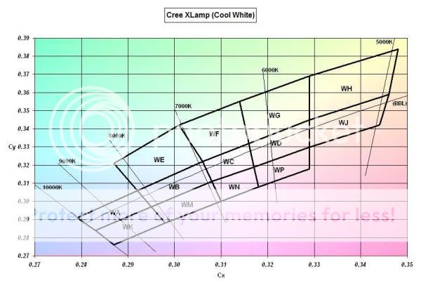
FWIW - Cree's WC bin unfortunately can vary within the bin since its color temperature range is 6,300-7,000 degK - this is exactly as advertised a "cool white" which actually has a tendency toward blueish - when compared to 5,500-6,500 degK of typical daylight.
Cree binning chart -
Cool Whites (I borrowed this from this excellent thread -
Bin Coding: Color, Flux, Vf Charts, Links (Luxeon, XLamp, SSC Z-Power/Acriche, Ostar by DFiorentino) -
The typical WC bin is in the color temperature range of 6,300-7,000 degK - this is just too blue for daylight white balance in photography - most cameras are balanced for around 6,000 degK - the ideal range would be about 5,500-6,500 degK which is closer to a WD bin.
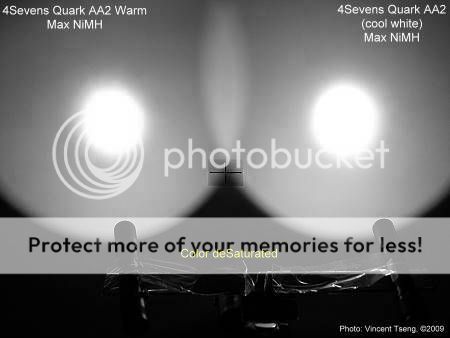
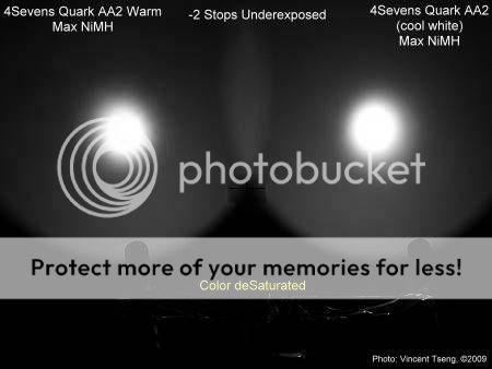
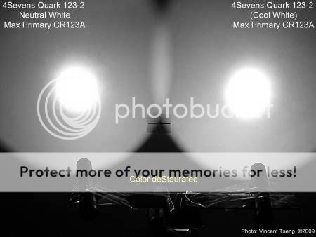
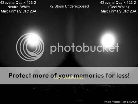
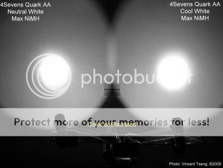
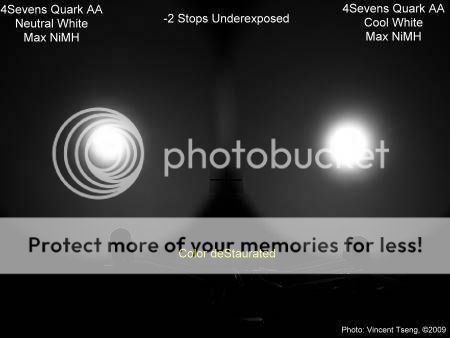
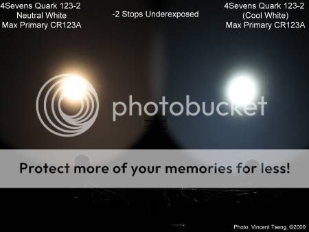
Here are some actual beamshot examples - all taken with fixed daylight white balance -
Neutral White vs. regular Cool White -
4Sevens Quark 123-2 Neutral, Tactical, Cool White Comparison Review
see how
UN-white both lights are when compared side-by-side?
First the Neutral white (Q3 5A) definitely ain't white when taken with fixed daylight balance -
the regular cool white (bin WC) is actually a very blue sample -
but this slight exaggeration help illustrate the critical nature when we are talking about colors in photography - something our eyes/brain would probably adjust for, and find more than acceptable - all of a sudden gets revealed as a serious flaw when photographed.
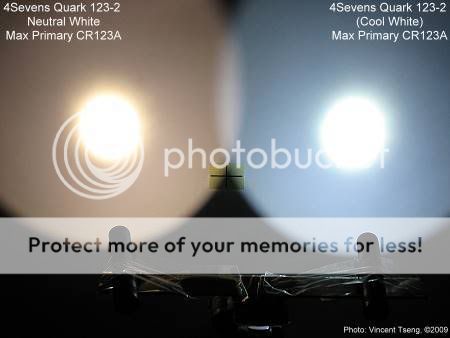
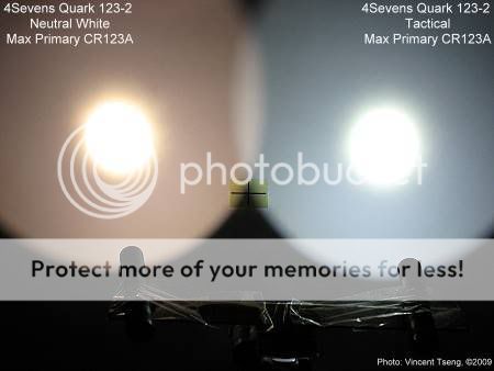
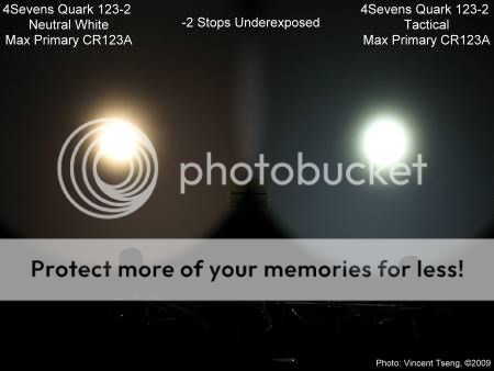
OK how about nicer cool white tints?
Neutral White vs regular Cool Whitein Tactical version
again the Tactical cool white looks more blue because it is in direct comparison with a warmer Neutral white - but one can see that it is a little less blue than the regular cool white in the standard version - this is probably just variations within the same WC bin.......
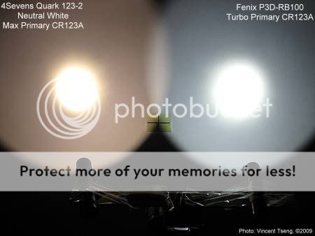
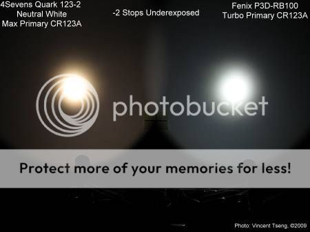
Neutral White vs.
Fenix P3D-RB100
this Fenix P3D-RB100 (using Philips LumiLEDs Luxeon Rebel LED) has one of my favorite tints for a regular cool white - but in comparison it still has a slight blueish tinge.....

 I know in this case it may be specified, but it may be helpful for others to bear in mind that there are cooler R2 LEDs and warmer R2 LEDs.