Battery Guy
Enlightened
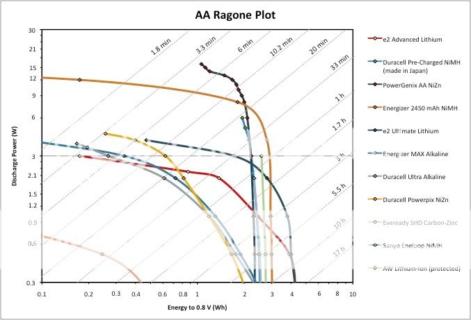
[Message from the OP: Separate threads have been created for all Ragone Plot updates. At present, there are AA Ragone Plot and 18650 Ragone Plot threads that I am actively updating. Please refer to those threads for the most recently updated plots. I will not be updating the plots in this thread, although I will be answering general questions in this thread as they come up. Cheers- Battery Guy]
I have been inspired by the work of many CPF members to bring information to the masses. The Herculean efforts of LuxLuthor, Silverfox and others are extremely valuable for the amateur (and pseudo-pro) torch aficionados.
So I have been looking for a way that I can contribute something to the CPF in a field that I know something about: batteries. In searching the CPF archives I was surprised that there has been very little talk about Ragone plots. Ragone plots are used as a way to perform "apples to apples" comparisons between batteries of different chemistries, shapes, sizes and weights.
Much of the data in the battery shootout tests that I have seen on CPF is presented in constant capacity and/or constant resistance discharge curves. Discharge curves are great, and provide a lot of data, but you need to look a many curves plotted on several plots in order to compare large numbers of cells. In addition, the results make it difficult to assess how different cell voltages might affect performance.
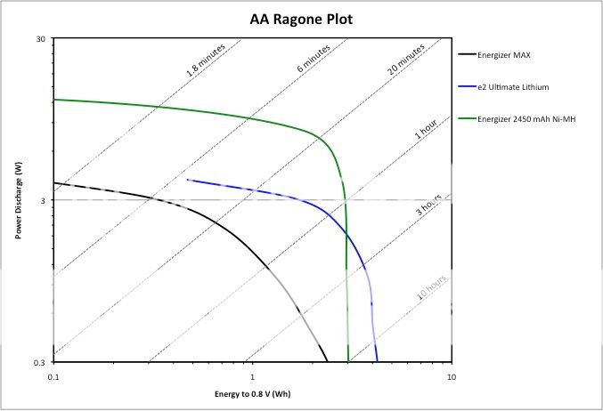
Enter the Ragone plot. A typical Ragone plot shows discharge energy (Wh or mWh) versus discharge power. An example Ragone plot for three different AA cells is shown in the plot below:

The data on this Ragone plot was collected on a Maccor cell tester using constant power discharge and measuring the discharge energy to a 0.8V cut-off. Each curve represents the results of 6-8 discharge tests.
You will also notice diagonal lines labeled with different times (1.8 minutes, 6 minutes, etc…). These lines represent run time. Finally, note that the data is plotted on a log-log scale, so relatively small differences in the curves can correspond to big performance differences.
Here are a few examples for how you can use the data on a Ragone plot:
Example 1: Let's say that you have an 8AA flashlight with a 24W bulb and you want to find the appropriate battery. This configuration would give you 3W per cell (doesn't matter what series/parallel arrangement of cells you use). Going to the Ragone plot, you can quickly see that at 3W, you will get ~6 minutes from the Energizer MAX alkaline, ~30 minutes from the e2 Energizer Lithium and ~1 hour from the Energizer 2450 mAh NiMH.
Example 2: Let's say that you want to have a run time of at least 20 minutes. Following the 20 minute diagonal line, you can see that the maximum power levels per cell will be ~2.1W for the alkaline, ~3.5W for the lithium and ~8W for the NiMH.
By studying Ragone plots, you can start to understand why there is so much variability in battery performance tests at high power. If you are testing a particular cell at power levels that are near the plateau portion of the curve (e.g. ~9W for the NiMH cell in the above plot), then it is apparent that a small shift in the position of that plot on the graph will have a huge impact on measured performance. Therefore, it is advisable to select cells that operate on the vertical portion of the Ragone curve to minimize cell-to-cell performance variability.
If you search for Ragone plots on the web, you will find that most of them actually show the relationship between specific energy/specific power (Wh/kg versus W/kg) or energy density/power density (Wh/l versus W/l). By normalizing performance to battery weight or volume, you can make real comparisons between cells of different sizes, shapes and weights.
For the time being, I am going to focus on the creation of a AA-size Ragone plot. Since all AA cells are the same size and shape, and since not too many of us care about the weight of the cells, I will leave the axes as energy versus power.
So far, I have tested and plotted data for the following cells:
Energizer MAX alkaline
Duracell Ultra alkaline
Duracell PowerPix alkaline (NiOOH cathode)
Energizer e2 Ultimate Lithium
Energizer e2 Advanced Lithium
Energizer 2450 mAh NiMH

A couple of the cells are being tested at lower power levels, and I will add those results next week. I am also in the process of testing Duracell 2000 mAh pre-charged (which I believe are made by Sanyo and identical to Eneloops).
All of the above cells were purchased from Target and tested within a few days. Since I have been focusing on higher power testing, all cells were tabbed with spot-welded nickel tab stock to minimize contact resistance issues.
If you have a favorite cell that you want added, please let me know. Right now, I would prefer to test newly purchased cells only, but in the future it might be nice to look at how the performance of certain popular rechargeable cells changes with use.
Comments, criticism, suggestions all welcome. Please let me know if you find this all to be mundane and find no value in it. Last thing I want is to spend a lot of time doing something that the CPF finds no value in.
Cheers Everyone,
Battery Guy
I have been inspired by the work of many CPF members to bring information to the masses. The Herculean efforts of LuxLuthor, Silverfox and others are extremely valuable for the amateur (and pseudo-pro) torch aficionados.
So I have been looking for a way that I can contribute something to the CPF in a field that I know something about: batteries. In searching the CPF archives I was surprised that there has been very little talk about Ragone plots. Ragone plots are used as a way to perform "apples to apples" comparisons between batteries of different chemistries, shapes, sizes and weights.
Much of the data in the battery shootout tests that I have seen on CPF is presented in constant capacity and/or constant resistance discharge curves. Discharge curves are great, and provide a lot of data, but you need to look a many curves plotted on several plots in order to compare large numbers of cells. In addition, the results make it difficult to assess how different cell voltages might affect performance.
Enter the Ragone plot. A typical Ragone plot shows discharge energy (Wh or mWh) versus discharge power. An example Ragone plot for three different AA cells is shown in the plot below:

The data on this Ragone plot was collected on a Maccor cell tester using constant power discharge and measuring the discharge energy to a 0.8V cut-off. Each curve represents the results of 6-8 discharge tests.
You will also notice diagonal lines labeled with different times (1.8 minutes, 6 minutes, etc…). These lines represent run time. Finally, note that the data is plotted on a log-log scale, so relatively small differences in the curves can correspond to big performance differences.
Here are a few examples for how you can use the data on a Ragone plot:
Example 1: Let's say that you have an 8AA flashlight with a 24W bulb and you want to find the appropriate battery. This configuration would give you 3W per cell (doesn't matter what series/parallel arrangement of cells you use). Going to the Ragone plot, you can quickly see that at 3W, you will get ~6 minutes from the Energizer MAX alkaline, ~30 minutes from the e2 Energizer Lithium and ~1 hour from the Energizer 2450 mAh NiMH.
Example 2: Let's say that you want to have a run time of at least 20 minutes. Following the 20 minute diagonal line, you can see that the maximum power levels per cell will be ~2.1W for the alkaline, ~3.5W for the lithium and ~8W for the NiMH.
By studying Ragone plots, you can start to understand why there is so much variability in battery performance tests at high power. If you are testing a particular cell at power levels that are near the plateau portion of the curve (e.g. ~9W for the NiMH cell in the above plot), then it is apparent that a small shift in the position of that plot on the graph will have a huge impact on measured performance. Therefore, it is advisable to select cells that operate on the vertical portion of the Ragone curve to minimize cell-to-cell performance variability.
If you search for Ragone plots on the web, you will find that most of them actually show the relationship between specific energy/specific power (Wh/kg versus W/kg) or energy density/power density (Wh/l versus W/l). By normalizing performance to battery weight or volume, you can make real comparisons between cells of different sizes, shapes and weights.
For the time being, I am going to focus on the creation of a AA-size Ragone plot. Since all AA cells are the same size and shape, and since not too many of us care about the weight of the cells, I will leave the axes as energy versus power.
So far, I have tested and plotted data for the following cells:
Energizer MAX alkaline
Duracell Ultra alkaline
Duracell PowerPix alkaline (NiOOH cathode)
Energizer e2 Ultimate Lithium
Energizer e2 Advanced Lithium
Energizer 2450 mAh NiMH

A couple of the cells are being tested at lower power levels, and I will add those results next week. I am also in the process of testing Duracell 2000 mAh pre-charged (which I believe are made by Sanyo and identical to Eneloops).
All of the above cells were purchased from Target and tested within a few days. Since I have been focusing on higher power testing, all cells were tabbed with spot-welded nickel tab stock to minimize contact resistance issues.
If you have a favorite cell that you want added, please let me know. Right now, I would prefer to test newly purchased cells only, but in the future it might be nice to look at how the performance of certain popular rechargeable cells changes with use.
Comments, criticism, suggestions all welcome. Please let me know if you find this all to be mundane and find no value in it. Last thing I want is to spend a lot of time doing something that the CPF finds no value in.
Cheers Everyone,
Battery Guy
Last edited:


