SPY005 logo design contest

Status
Not open for further replies.

IsaacHayes

Flashlight Enthusiast
Joined
Jan 30, 2003
Messages
5,876
Location
Missouri
Data: Thanks, I just threw some stuff together and didn't tweak it much or organize it. I didn't spend anytime looking at fonts. The one you like is closest to what I originally pictured in my head. I'll refine it a bit here tonight. I kinda like the 005 in between spy, do you think it'd be better elsewhere?
Broken link- Hmm. I see only one image I thought the post editor took it out, I'll see if I can't fix it some how..
 

wmpwi

Enlightened
Joined
Mar 27, 2005
Messages
348
Location
Western Michigan
I agree in that keep it simple is always best, particularly for logo work. As to the craters, I personally believe that it would be a bit tough to make it look right, but it also distracts from the total image. Just my thoughts though. Adjustments edited in original post.


Data said:
flashlight

wmpwi

That is nice. I like it a lot. I wonder if it needs 005, if you try it, that is cool. Do you thing a couple artistic moon creators would look good? It might be too much. But then maybe moon creators that look like "005".

Also, could we see that in an outline version with no fill?
Keep them coming guys.
 

Data

Flashlight Enthusiast
Joined
Feb 18, 2005
Messages
3,298
Location
PA, USA
Yea that really looks great. This is what I meant on the shading though.

spyround25c[1].jpg
 

wmpwi

Enlightened
Joined
Mar 27, 2005
Messages
348
Location
Western Michigan
Yeah, I had that too, but there are so many permeations, I had to stop somewhere and can't post them all. And you're no slouch with PS either are you.

:twothumbs
 

Data

Flashlight Enthusiast
Joined
Feb 18, 2005
Messages
3,298
Location
PA, USA
wmpwi

I have had a love affair with Photoshop for many years.

BTW, I am not saying I like it more my way, I just wanted to see it both ways. In fact I think it is difficult to imagine what any of these would look like on a finished light.

I plan to eventually shop in some of the more favorite proposals onto the CAD rendering at the top of this thread. The one on there now is vague on purpose so everybody gets an idea of what it would look like and about how big of an area I want to use for the logo.


nemul

Those are great, I wonder which would look the best when scaled to .35".
 

Moe

Newly Enlightened
Joined
May 6, 2004
Messages
88
Location
Germany
Great, a design-contest! :D

Whats the thinnest possible line for the laser etching? 0.3 mm? 0.5?
 

Data

Flashlight Enthusiast
Joined
Feb 18, 2005
Messages
3,298
Location
PA, USA
I do not know the answer to your question. It has to do with the lens used on the laser. The laser engraver has a position resolution of 600 dpi. They have told me that if you like what you see when you print it actual size (.035") on a laser printer, then that is a good starting point.


Dave
 

IsaacHayes

Flashlight Enthusiast
Joined
Jan 30, 2003
Messages
5,876
Location
Missouri
PS is kicking my butt. They changed so much, including the shortcuts! I don't have my wacom, or my fonts, or my old comptuer hooked up. I gotta get my PC station cleaned up and going again sometime!! I haven't done graphics since aug 1999! Man I need to get back into it. I'm feeling rusty & stupid.

Data, how big is the area for the logo? That would help if I were to make a 600dpi image as I would need to know the size.

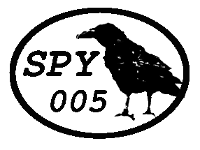
Here is a more refined logo what I first thought up. I think it's pretty good and as of now don't have any desire to figure out anything different as I like it well enough. :shrug:

SPY005_2.gif


Here is some teaser images. Look the light has another friend now! :)
SPY005_3.gif


And here they are on the moon... :nana:
SPY005_4.gif


Well off to relax now. To think I did stuff like in my signature in the time it took me to just draw this 2D line art, man I gotta get PS 5.0 back, or learn 7.0 soon!! :p

Let me know if you like it, or what subtle details to tweak. "Contrast" can always be changed and details made more "bolder & simpler" but I've seen some sharp laser etching so I started with lots of details to begin with.
-Isaac
 

IsaacHayes

Flashlight Enthusiast
Joined
Jan 30, 2003
Messages
5,876
Location
Missouri
Did some thinking in the middle of some DooM 3 deathmatch, I can tweak the text on them. I like the basic setup, but the text could varry and experiment with different fonts, and text arangements. Perhaps the 005 could be bigger and wrapped around the bottom of the circle. I'll make some variations tommorow.
 

McGizmo

Flashaholic
Joined
May 1, 2002
Messages
17,291
Location
Maui
Data,

I had to get a better crow to you, even though I am not in the competition! :nana:

crowstands-l.gif


crowstands-s.gif


Do you recognize the crow? :grin2: No pidgen there! :p
 

JimH

Flashlight Enthusiast
Joined
Apr 8, 2004
Messages
2,714
Location
San Jose, CA
It occurred to me, after looking at all these interesting designs, that there will probably need to be more than one round of balloting in order to narrow the field down to 3 or 5 or whatever for a final ballot.
 

Data

Flashlight Enthusiast
Joined
Feb 18, 2005
Messages
3,298
Location
PA, USA
Holly Cow! You guys are insane, Great stuff! :wow: :thanks: :clap:

nemul

Great work and good scale on the back of the light.


LowWorm

Your second image is great, good job, keep working it. Can you close the beak and refine the typical Crow's head just a little.


McGizmo

LOL, nice. :nana:


evanlocc

I like 2nd of 4 the best.


IsaacHayes

Very nice! Great "burning" in photoshop. I do have a request, that you reduce the size of the logo relative to the size of the light. It looks too large to me. I tried to size it up and I would say you are just over .35".


Everybody

Your submissions are super, keep it up.

I am thinking of reducing that size to .30". The best logos are the ones that are artistic and simple! Look at what LowWorm and wmpwi have done. Try to use less ink and I would love to see some more entries with just part of a crow showing.

:popcorn:

Cheers
Dave
 

IsaacHayes

Flashlight Enthusiast
Joined
Jan 30, 2003
Messages
5,876
Location
Missouri
I see the size now that it needs. I'll make one that will be technically accurate. I just PS'ed them onto the light. I did see they came out looking big but it wasn't to scale or anything.
UPDATE: I checked my image, @ 600dpi its both smaller than .35" and .30". I'll see what it looks like at 300dpi .30" as that's the smallest case senario.

EDIT: Here it is 300dpi .30" 2 colors. Looks good. I'll try more text styles from my original now that I know it can be scaled for the light.
1.
SPY005_5.gif
2.
SPY005_6.gif
3.
SPY005_7.gif
two colors. 300 dpi. .30" x .30"

Data: Does the laser etcher need a graphic in 2 colors? I would imagine so, unless it can do varying shades/depths of "etch" like gray scale..

EDIT: added more variations. I like #2 the best.
 
Last edited:
Status
Not open for further replies.
Top