CPF Gear ....gotta create a new Logo

qip

Flashlight Enthusiast
Joined
Jan 10, 2007
Messages
1,503
Location
u.s
though.. a button still?


yes but on a black or white shirt it may not look as bad being its a black crispy edgy looking logo and on a black shirt it may blend in better than one would think


homework, this is much more important than homework :grin2:
 

Greta

Flashaholic
Joined
Apr 8, 2002
Messages
15,999
Location
Arizona
I decided to stick with the pill because it is CPF.. has been since almost the beginning. I drew a picture of the Nike "swoosh" on a piece of paper and showed it to my son. Asked him what he thought of. He said "Nike" without hesitation. Then I asked him what "logo" he thought of when I mentioned CPF... without hesitation he said, "the pill". Like it or not... it is CPF... :shrug:
 

Greta

Flashaholic
Joined
Apr 8, 2002
Messages
15,999
Location
Arizona
... and yes Craig... some modifications will need to be made for the T-shirt designs. I already have ideas for those. I'll post them all when I get them done.
 

Aircraft800

Flashlight Enthusiast
Joined
Apr 24, 2007
Messages
1,487
Location
DFW Texas.
I like your ideas, but the double pill just doesn't sit good with me. The small one with CPF in it looks out of place. One backdrop pill shape is fine, but drop the CPF one altogether. Maybe work on the CPF text, either a different font, or much bigger letters. The slogan ideas are all good too, we need one.

EDIT: Hey wait, I thought we were not talking about this :shakehead
 

Greta

Flashaholic
Joined
Apr 8, 2002
Messages
15,999
Location
Arizona
EDIT: Hey wait, I thought we were not talking about this :shakehead

It is a girl's prerogative to change her mind. Especially if she's spent a week hanging out on a Caribbean island taking in the peaceful feng shui and communing with the fishes.
 

Blight

Newly Enlightened
Joined
Nov 6, 2008
Messages
52
Location
desolate darkness
qip... I would like the blue rays to the edge too. I will see what I can do. The problem with it is evident in your quote of the images... see the white "shadow" out beyond the edges of the black pill? I can fix it... just need to tweek a few things.

The logo was just something I thought perhaps might be nifty. I honestly can go either way with that.

Either option....

this...
revisedtitle1.gif


or this...
revisedtitle300.gif


... would be easily modified for the other CPF sites. I have already worked up so examples for CPFMarketPlace, CPFUnderground and CPFGreen. They are still in .psd format though. I'll get them worked up in .gif format and get them posted later when I get my homework assignments done... (damn classes... :crazy: )

BTW qip... thank you for your input... :grin2:

Just adding an opinion. Of the two badges, I like the top one better,, but there's something about the font that looks off when spelling out CPF. I also think you should move the glare off the the right a bit. Both are much better than the current blue pill one.

While the badge might look nice on a mug or keychain, I think simplicity might be best for a t-shirt. I like the middle left one. :)


Zeruel

Flashlight Enthusiast
Joined
Jan 1, 2009
Messages
3,286
Location
SIN
It is a girl's prerogative to change her mind. Especially if she's spent a week hanging out on a Caribbean island taking in the peaceful feng shui and communing with the fishes.
:crackup: :crackup: :crackup:


I'm glad a change is reconsidered. :)
 

Ajay

Enlightened
Joined
Dec 12, 2008
Messages
284
Location
Queens,NY
I like where this is going. Can't wait for the finalized version.
I need me a T-shirt.

:popcorn:
 

qip

Flashlight Enthusiast
Joined
Jan 10, 2007
Messages
1,503
Location
u.s
at the very least,the progress is promising


petrev

Flashlight Enthusiast
Joined
Jun 12, 2005
Messages
1,535
Location
SW England
Yes - Pill for Websites

BUT

11111pxrw.jpg


Simpler - No Big Block of Ink (nasty tends to crack with use/abuse etc.)
or major area of expensive embroidery needed.

Change fonts etc as desired . . .

Cheers
Pete
 

Greta

Flashaholic
Joined
Apr 8, 2002
Messages
15,999
Location
Arizona
Let me explain a few things so some of you won't be wasting your time.

I am using Cafe Press for the CPF Gear. They have quality products and more importantly, they cut out the middle man... me. You order directly from them, they make the product when it is ordered (no inventory to maintain) and ship it directly to you.

The hitch is that they kinda have issues with transparent backgrounds. This is why it's at least good to have the pill.... minimizes that issue. I can try to work on that but there's just so much that can be done.

Keep in mind also that white t-shirts will also be available. I can make adjustments for that but will still have the transparent background issue.

Now to the embroidery. There are only a few products that are available with the embroidery... the polo shirts, some of the caps... and they are done in a "patch" type way. It is a round template and again the transparent background can be an issue. I'm thinking though that the design without the pill would work out very nicely for that. (Thank you Petrev... I'd not thought of that... ;) :thumbsup: )

My thoughts for the products is to include the ".com" after "CandlePowerForums" but omit it for the forums... redundant.

No Big Block of Ink (nasty tends to crack with use/abuse etc.)
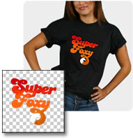
This is not an issue with the Cafe Press products. I have a t-shirt from a few years ago that is still as nice as the day I got it. And my new organic t-shirt is awesome as well. BTW... the organic t-shirts? By FAR!... the softest, nicest t-shirt I own. I REALLY like it!! :twothumbs

That's all I can think of right now.... :grin2:
 

petrev

Flashlight Enthusiast
Joined
Jun 12, 2005
Messages
1,535
Location
SW England
Hi Greta

Cafe Press seem OK - Just have to set the background for black shirts eg the transparent colour so that white doesn't dissapear. May have to do another artwork for light shirts if desired but the above one has a dark drop shadow anyway I believe.

Personally I like Black or Dark Grey

Cheers
Pete

ps. I like the design without the .com
The .com is understood
or if an interested party want's to find the clan they will just search Google and up we pop !

Cafe Press design guide
http://www.cafepress.com/cp/learn/index.aspx?page=blackshirts
Designing for Dark Apparel

blackshirt.jpg
When designing for dark t-shirts at CafePress, keep in mind that white areas of your designs will no longer be treated as transparent when printing on dark. For example, if your image is on a white background, the white background will be printed along with your design. The whites of the eyes will be white, not the color of the garment.
You'll want to create and upload transparent images to obtain professional looking t-shirt designs. Start by choosing your background color.

etc.
 
Last edited:

Greta

Flashaholic
Joined
Apr 8, 2002
Messages
15,999
Location
Arizona
Petrev... Yes, I am aware of the Cafe Press info regarding background colors and all that. I actually read it before I started working on this! ;)
 

Greta

Flashaholic
Joined
Apr 8, 2002
Messages
15,999
Location
Arizona
Wow, that new graphic is nice!

Can we get some form of CPF light, any kind?

Just need to get one (or more).

:thumbsup:
That would be up to some manufacturer to set up. And the design, etc. would need to be approved by me first. I doubt any manufacturer would do anything other than a numbered limited run. And of course, it would have to be a quality light... sorry, but I'm not going to have the CPF name on some cheap knock-off or clone.
 
Top